Brand Design · Visual Identity · Campaign
Skull Candy
A Diwali brand campaign concept for Skullcandy — blending the festival's light and fire energy with the brand's rebellious, counter-culture identity through visual design and motion.
01 — Brief & context
The brief
Skullcandy is a headphone brand that built its identity around irreverence, youth culture, and bold graphic design. Diwali — India's festival of lights — is one of the highest-spending consumer periods in the country, yet most brand campaigns default to warm golds and safe family imagery.
The challenge was to create a Diwali campaign that felt authentically Skullcandy: high-contrast, bold, and a little subversive — while still honouring the festival's spirit of light overcoming darkness.
02 — Brand & product
The brand building blocks
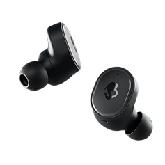
The campaign was anchored in two visual elements: the Skullcandy skull icon (recoloured in the brand's signature purple) and the actual product — the Dime True Wireless earbuds, chosen for their accessible price point that fits a festival gifting context.

03 — Concept direction
Light vs dark, reimagined
Diwali's central narrative is light over darkness. Skullcandy's visual language lives in darkness — black backgrounds, neon accents, high contrast. The campaign concept turns this tension into a statement: "This Diwali, the darkness sounds incredible."
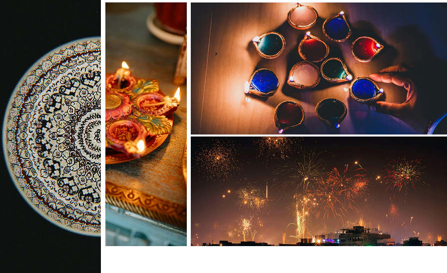
The mood board pulled from three visual references: the warm glow of diya lamps for colour temperature, the scattering patterns of traditional rangoli for graphic motifs, and fireworks for energy and movement.
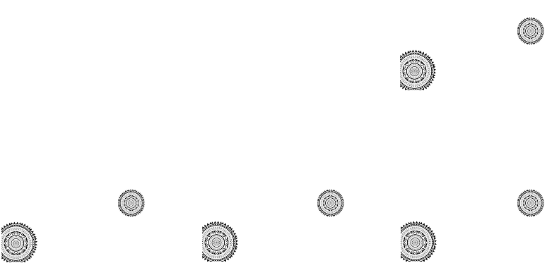
The mandala/rangoli motifs were extracted and used as a background pattern system — scattered at varying opacities and scales to create depth without competing with the product.
04 — Visual direction
Festival energy meets brand identity
The campaign palette maintained Skullcandy's signature purple and black base, with Diwali gold and warm amber introduced as accent colours — echoing the diya flame without replacing the brand's core visual character.
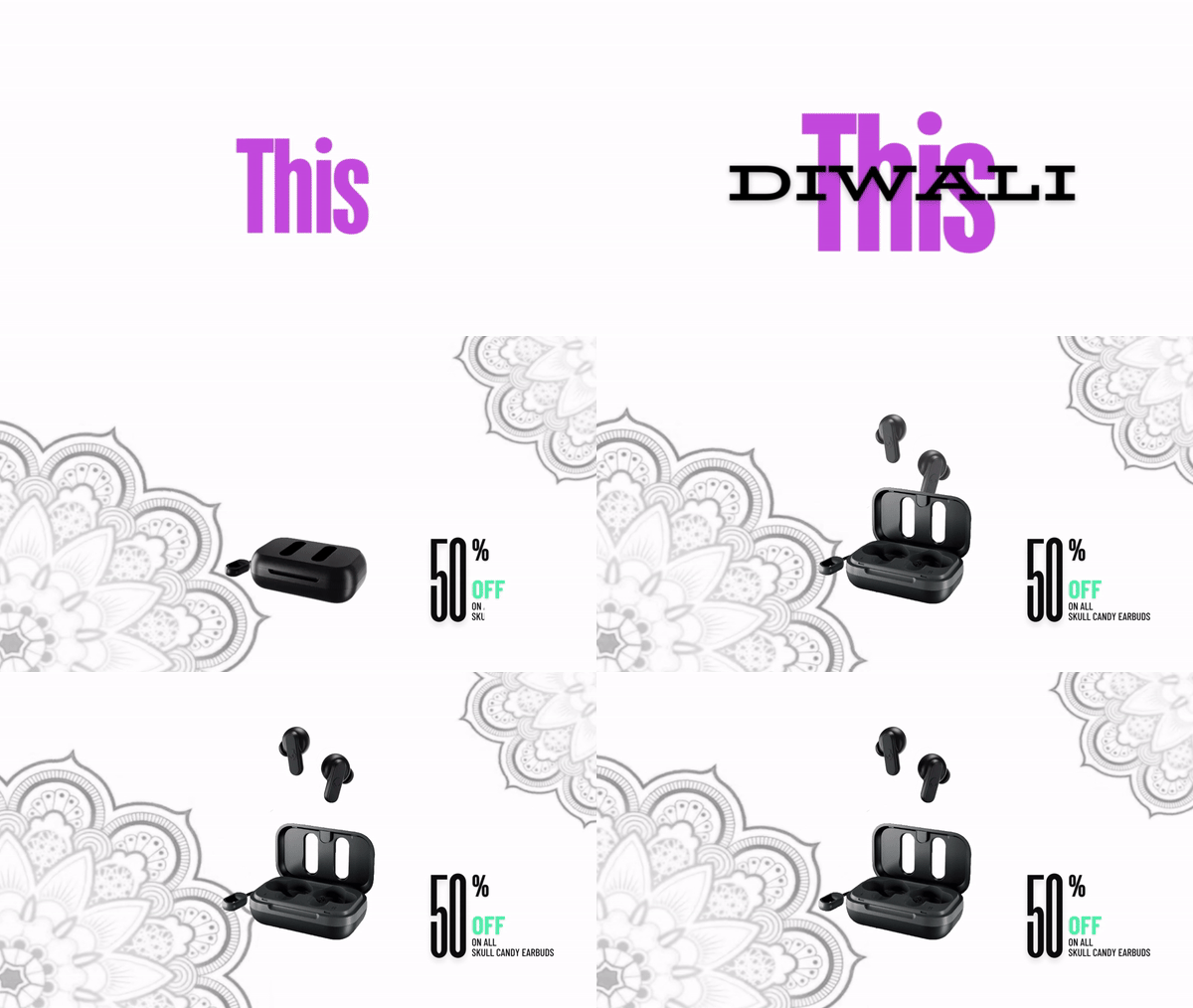
Typography used bold, heavy weight type — short, punchy lines that work as social captions, billboard copy, and packaging copy simultaneously. The motion concept (executed as a GIF for social) built the final scene word by word, using the typographic rhythm to mirror a firework's build-and-burst.
"The best Diwali campaign for a headphone brand isn't one that says 'listen to Diwali music' — it's one that sounds like how Diwali feels."
05 — Outcome
Result
1
Campaign concept
3
Visual references
2
Deliverable formats
This was an academic brand project exploring how an established global brand could authentically engage with a regional cultural moment without losing its identity. The key learning: festival campaigns fail when the brand identity is replaced by generic festival aesthetics. The strongest work uses the festival as a lens through which the brand's existing personality is amplified, not replaced.