Kiosk Design · App Design · UX Research
Scoops of Joy
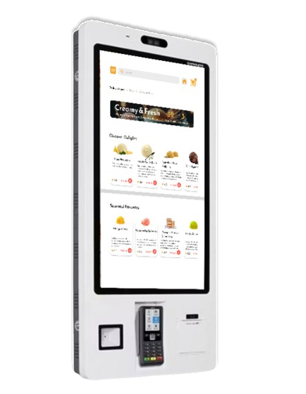
A self-ordering kiosk and companion app for Urban Scoops — an Indian ice cream brand — designed to make the ordering experience as delightful as the product itself.
01 — Problem & context
The ordering gap
Small and mid-size ice cream parlours in India often rely on counter staff to take orders — a process that slows down during peak hours, creates language barriers (especially in multilingual cities), and puts pressure on a typically thin workforce.
Urban Scoops wanted a self-ordering solution that would let customers browse, build their order, and pay — without waiting in line or struggling to communicate preferences. The challenge was making this feel joyful, not clinical.
02 — My specific contribution
What I designed
Working solo across research, information architecture, and visual design, I delivered:
- End-to-end kiosk ordering flow (attract → language → browse → cart → payment → confirmation)
- Companion mobile app UI for the same catalogue and ordering system
- Multilingual onboarding — Hindi, Marathi, English, and Gujarati
- Microinteraction design for cart feedback and upsell moments
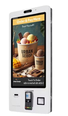
- Physical kiosk mockup for presentation
03 — Research
Understanding kiosk users
I observed ordering behaviour at a few quick-service ice cream counters in Mumbai. Three patterns stood out:
- Decision paralysis — large menus with no visual hierarchy made choosing hard
- Language friction — customers defaulted to pointing rather than reading English-only menus
- Cart anxiety — customers were unsure if their selections were registered, leading to repeated taps or asking staff
These findings shaped three design principles: visual-first browsing, mother-tongue comfort, and instant feedback at every tap.
04 — Process
The ordering flow
I mapped a linear, low-friction path: attract screen → language select → browse catalogue → add to cart → upsell → payment method → UPI/cash → order confirmation. Every step was designed to require minimal reading.
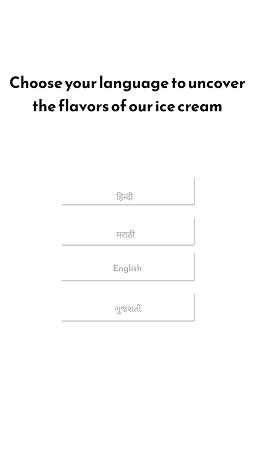
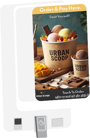
The language screen is the first human touchpoint — leading with regional scripts immediately signals inclusivity. The attract screen leads with appetite: bold food photography rather than text or icons.
05 — Design decisions
Key choices
Logo
The Urban Scoops logomark combines fruit scoops and a spoon — instantly communicating both indulgence and choice. The B&W version confirms it works across single-colour print contexts like receipts and packaging.


Colour palette
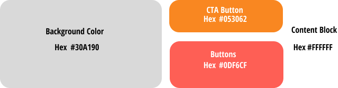
The palette leads with a warm neutral background, a deep navy for primary CTAs, a coral-red for interactive buttons, and white for content blocks — keeping the interface warm and appetite-forward.
Catalogue — visual-first grid
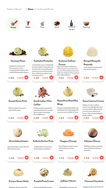
Photo-led cards, not text lists
Each flavour card leads with a large photograph of the scoop, followed by the name, a star rating, and price. The + button is orange — the only coloured element — making the add action unmissable.
The breadcrumb (Today's Mood · Store · Ice Cream Packs) and the search bar give power users shortcuts without cluttering the first-time experience.
Cart — inline review before pay
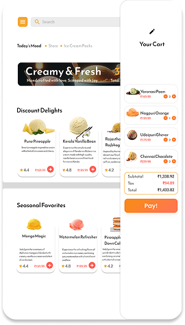
One-screen checkout
The cart shows item thumbnails, names, and quantities — plus a live running total. The Pay button is full-width orange, anchored at the bottom so it's always reachable on a kiosk touchscreen.
Tax is surfaced before payment — a deliberate transparency choice that reduces surprise at the terminal.
Product card — the item design system
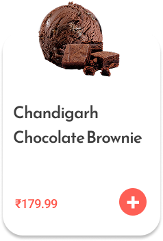
Consistent card anatomy
Every product card follows the same structure: photo at top, flavour name, rating (★), price in grey, add button in accent orange. The rounded corners and subtle drop-shadow differentiate the card from the pink-striped background without heavy borders.
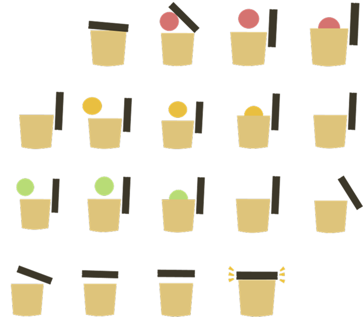
Cup icon — a custom animation system
The brand mascot — a minimal paper cup — needed to communicate different states: empty, adding a scoop (in various flavour colours), and a celebratory "filled" state. I designed a complete sprite system covering all permutations.
06 — The kiosk flow
From tap to receipt
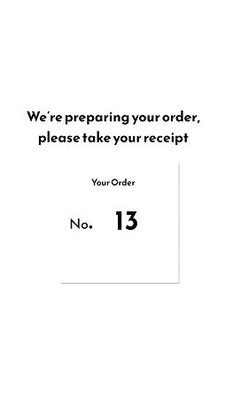
The full payment and confirmation flow was designed to handle both digital (UPI) and cash payments while keeping the experience consistent and reassuring at each step.
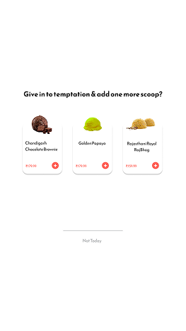
Upsell
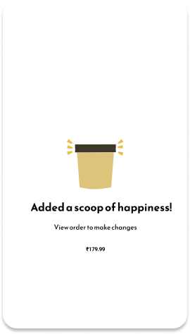
Item added
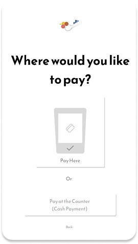
Pay method
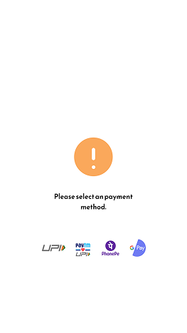
UPI select
07 — Outcome
Result
4
Languages supported
6
Key flow screens
32
Catalogue items
The kiosk design was validated through informal testing with 5 users across different language backgrounds. All participants completed an order without staff assistance. The upsell screen ("Give in to temptation") converted 3 out of 5 testers into adding an additional item — confirming that a playful, low-pressure prompt outperforms a utility-style “Add more?” dialogue.