App Design · UX Research · Mobile
Sip Well
A water-tracking app that keeps users motivated and conscious about their daily hydration through smart reminders, awareness nudges, and a calming visual language.
01 — Problem & context
The problem
Dehydration is one of the most common yet overlooked health issues among young people. Most existing water-tracking apps feel clinical and transactional — they log intake and set reminders, but they don't explain why hydration matters or make the habit feel rewarding.
The challenge was to design an app that goes beyond logging: one that builds awareness, sustains motivation over time, and feels pleasant to return to daily.
Core insight
Users know they should drink more water, but knowing isn't enough. The app needed to close the gap between intention and action through timely, contextual awareness — not just alerts.
02 — My specific contribution
What I did
This was a solo project. I owned the full design process end-to-end: user research, information architecture, visual design, and prototyping.
- Defined the problem statement and success metrics
- Conducted primary research (user interviews + surveys)
- Created user personas and journey maps
- Designed the full information architecture and user flows
- Built low- and high-fidelity wireframes in Figma
- Established the visual design system (typography, colours, icons, spacing)
- Delivered an interactive prototype
03 — Research
Understanding users
I spoke to potential users in the 16–25 age bracket — students and early professionals who are active but inconsistent about hydration. Three themes emerged consistently:
- Forgetfulness — they simply forget to drink during busy periods
- Lack of motivation — logging felt like a chore with no clear reward
- Ignorance about effects — they didn't connect poor hydration to daily symptoms (fatigue, headaches)
Rohan, 17
12th Grade Student · Mumbai, India
Goals
- Stay healthy
- Perform well in sports
- Maintain good grades
Pain points
- Forgets to drink during study sessions
- Doesn't know how much is enough
- Finds existing apps too complicated
04 — Process
How I got there
I began with a tight problem statement and worked outward — sketching core flows on paper before touching Figma. The main user flow was deliberately simple:
I structured the app around three pillars: Track (log intake), Remind (smart alarms), and Aware (daily facts and health tips). The onboarding collected just enough — gender, weight and age — to personalise the daily goal without friction.
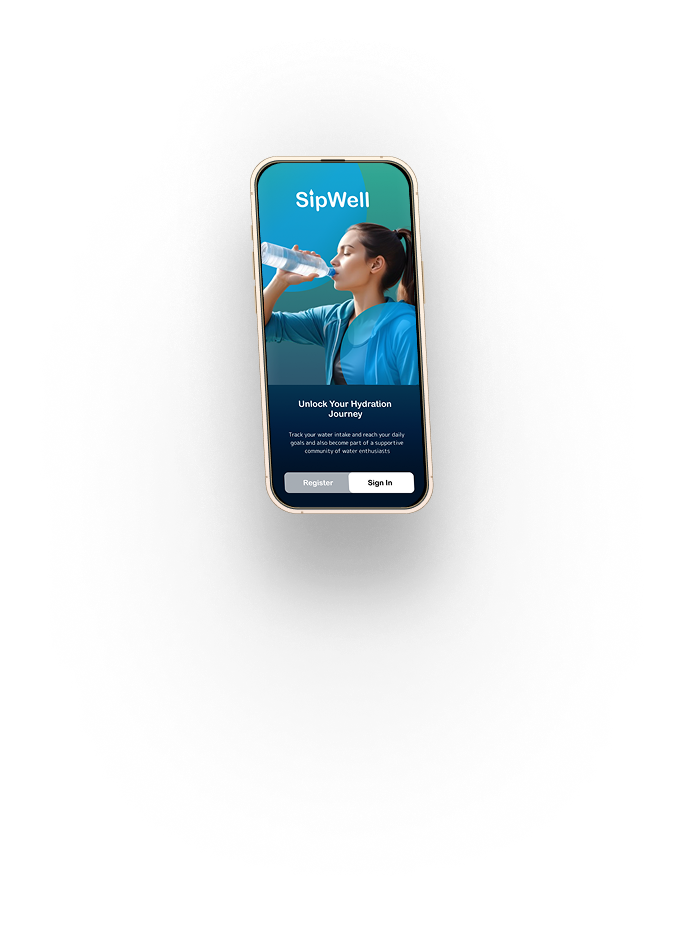
Splash / Onboarding
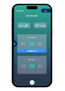
Profile setup (onboarding step 2)
05 — Design decisions
Key design decisions
Logo
The Sip Well logomark is a water droplet — chosen for immediate category recognition and clean scalability at small sizes. It works across both coloured and monochrome contexts.


Typography — Poppins
Poppins was chosen for its geometric, rounded forms that reinforce the app's water-inspired calm. Its clean lines reduce visual stress, making it easy to read at a glance — important for an app used mid-activity. The scale runs: Heading 1 Bold 24px · Heading 2 Semi-Bold 20px · Paragraph Light 17px · Button Medium 17px.
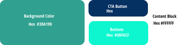
Colour — a considered palette
The four-colour palette conveys calm, trust, and freshness — the emotional register of hydration itself.
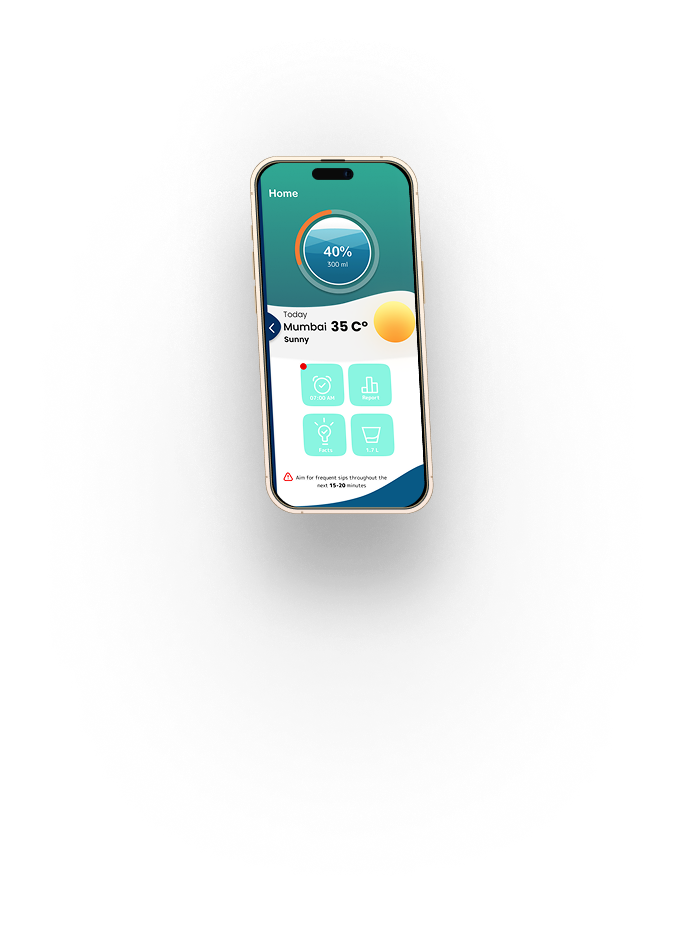
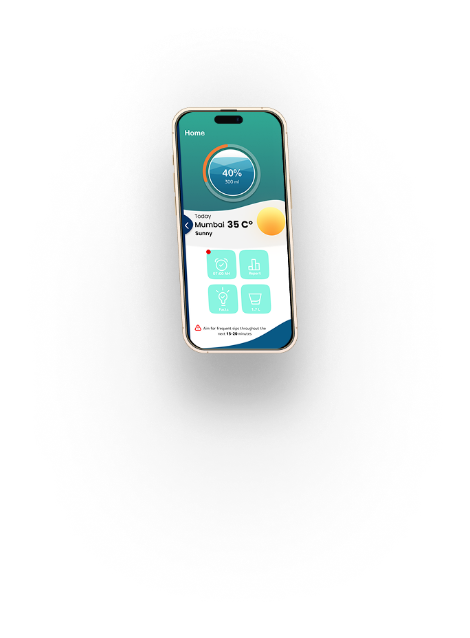
Home dashboard — one glance, full picture
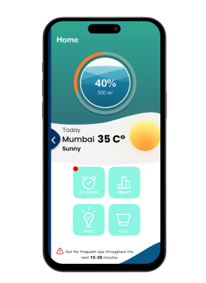
Glanceable progress at the top
The circular ring shows today's completion at a glance — no numbers required. Weather is surfaced because heat directly affects how much users should drink, contextualising the goal without adding cognitive load.
The four quick-action tiles (Alarm, Report, Facts, Water) were chosen based on the most frequent actions from the user flow mapping. Everything else is one tap away from here.
Awareness as a feature, not an afterthought
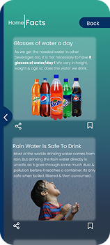
News-feed format for hydration facts
Most water apps reduce motivation to streaks or badges. I found users responded more strongly to understanding why. The Facts screen surfaces daily hydration knowledge in a scrollable news-feed format — familiar, low-friction, and educational without feeling like a lecture.
Articles are shareable (tap the share icon per card), turning passive awareness into a social moment.
Reminder system — alarm screen
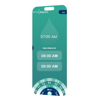
Scheduled alarms with a visual time picker
The rotary wheel picker makes setting reminder intervals feel tactile and intentional rather than typing numbers into a field. Users can see their full reminder schedule at a glance — current alarm plus the next two queued times.
What didn't work
An early version used high-frequency, aggressive alerts. User testing showed this felt nagging — testers disabled notifications entirely. The final design uses smarter defaults: 2-hour intervals, quiet during sleep hours, and a gentler visual tone.
06 — Core feature
The water tracker
The app was designed on an Android Compact frame (412×917px) with a 6-column grid. This constrained decision forced a focused, single-task-per-screen layout that keeps the key action — logging water — always prominent.
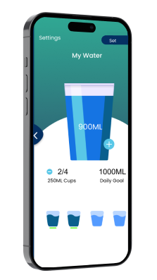
My Water — daily tracker
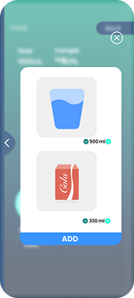
Add drink — quick log modal
The large cup illustration fills as users log intake throughout the day — giving a visceral, satisfying sense of progress. The "Add drink" modal intentionally includes non-water beverages (like Cola) to be honest about total hydration rather than policing habits.
Animated fill — two keyframes
The cup animation transitions between an empty state and a filling state. These two frames show how the visual feedback communicates progress before the user even reads a number.
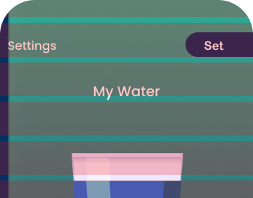
Empty state
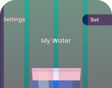
Filling state
07 — Final solution
All screens
The complete app spans onboarding, daily tracking, reminders, awareness, profile management, and analytics — all within a consistent teal visual system.
 Onboarding
Home
Water tracker
Log drink
Reminders
Facts
Onboarding
Home
Water tracker
Log drink
Reminders
Facts
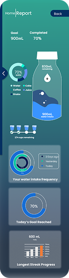 Report
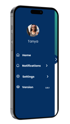 Profile
08 — Outcome
Result
8
Screens designed
3
Core pillars
2
Personas researched
Analytics that motivate, not guilt
The Report screen shows goal completion (70%), intake breakdown by drink type, a 3-day frequency chart, and longest streak — giving users enough data to understand their patterns without overwhelming them.
The final prototype tested as "educational" and "calming" across all users — matching the intended brand character. The Awareness pillar was cited as the most memorable differentiator.