App Design · Wearable UX · Fitness
Muscle Root
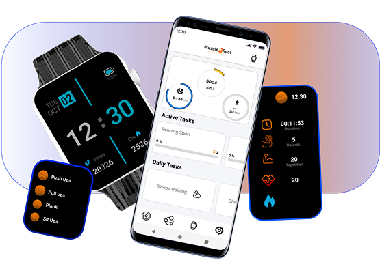
A fitness tracking app and smartwatch companion that turns workout planning into an effortless habit — tracking reps, rounds, and progress across daily, weekly, and monthly views.
01 — Problem & context
The tracking gap
Most fitness apps either do too much — overwhelming users with metrics, social feeds, and subscription upsells — or too little, functioning as glorified timers. Neither suits people who train consistently but don't want to manage a second job's worth of data.
Muscle Root was designed for disciplined gym-goers who want to log reps and rounds, track progress over time, and stay connected to a smartwatch — without the noise.
02 — My specific contribution
What I designed
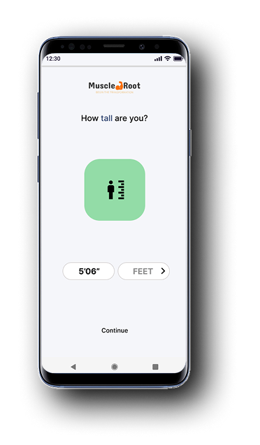
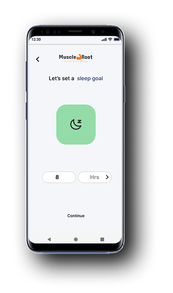
- Full onboarding flow — height, sleep goal, fitness objective
- Home dashboard with active and daily task overview
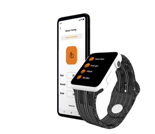
- Workout setup (exercise, reps, rounds, break time)
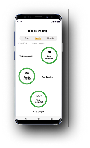
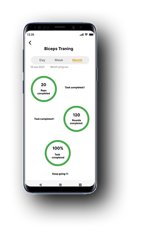
- Progress tracking with Day / Week / Month views
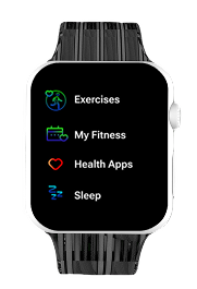
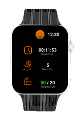
- Companion smartwatch UI — watch face, exercise list, countdown, active stats, timer
03 — Research
Understanding gym users
I spoke with regular gym-goers about how they track workouts. Most used a notes app or paper — not a fitness app. Reasons for abandoning apps:
- Too many taps to log a single set mid-workout
- No quick-glance view — reading a phone screen between reps breaks focus
- Progress felt invisible — charts buried in sub-menus
This directed the design toward three things: fast logging on the phone, a glanceable watch UI mid-workout, and surface-level progress visible the moment you open the app.
04 — Onboarding
Just enough setup
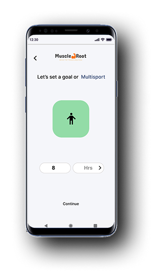
Onboarding collects three inputs: height (for calorie estimation), sleep goal (recovery), and fitness objective. Each screen is one question, one input, one tap forward.
05 — Design decisions
Key choices
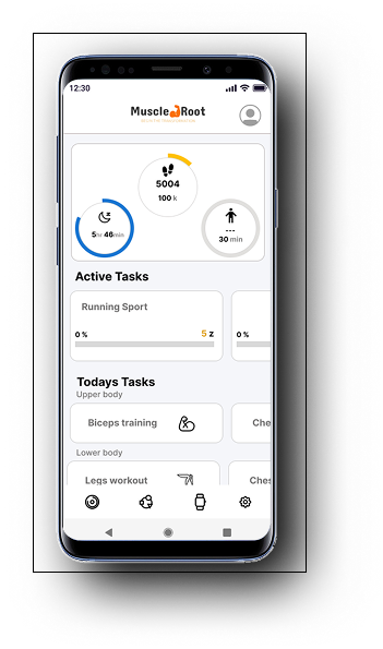
Home — tasks over metrics
What you need to do, not how you did
Rather than opening to a wall of health data, the home screen surfaces today's agenda. The circular ring gives a step-count glance; Active Tasks and Daily Tasks below tell you what's next.
Workout setup — structured once, tracked automatically
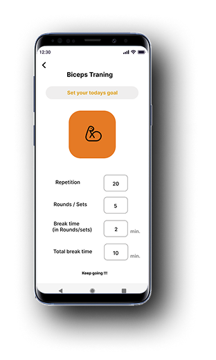
Set before you sweat
Configure reps, rounds, and break time before the session starts. Once underway, the watch takes over — tracking in the background while the phone stays in your bag.
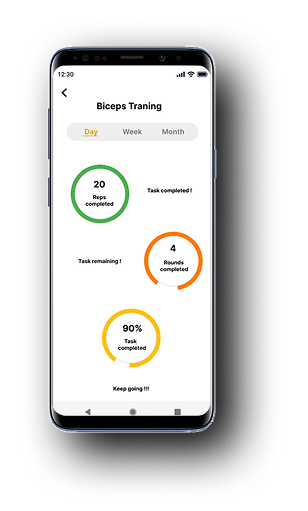
Progress — three time lenses
Day
Week
Month
Progress rings use orange for partial and green for complete. Day / Week / Month switch with a single tap on the segmented control.
06 — Wearable UI
The watch companion
The smartwatch UI was designed around one constraint: legible with sweaty hands, in a gym mirror glance. Large type, high contrast, minimal chrome.
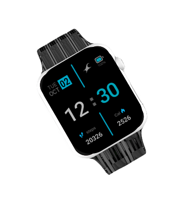
Watch face
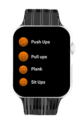
Exercises
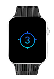
Countdown
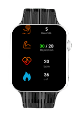
Active stats
07 — Outcome
Result
2
Platforms designed
3
Progress time lenses
4
Onboarding steps
The dual-platform design was the most ambitious part of this project. Constraining watch interactions to three taps maximum (select exercise → start → view stats) kept the wearable focused. Users in testing preferred reviewing progress on the phone after a session — confirming the watch's role is input, not analysis.