UX Research · Heuristic Evaluation · Fintech App Redesign
Rupaya
A heuristic-evaluation-driven redesign of a payday loan app's 12-step onboarding and KYC flow — prioritising depth on its two highest-severity usability problems over a shallow pass across every screen, inside a consistent dark, trustworthy visual system.
01 — Understanding the problem
Twelve steps before you know what you're getting
The reference product, PaisaPop, is a payday loan app. Its current journey takes an applicant through roughly a dozen steps — mobile number entry, PAN and Aadhaar verification, personal and employment details, bank account linking, a video KYC recording, and a final review — before ever showing them the loan amount they're being offered.
Rather than guess which of those twelve-plus screens actually needed work, I ran a heuristic evaluation against Nielsen's 10 usability heuristics across every screen in the reference journey, scoring each on a 0–4 severity scale, to find where the real friction was.
02 — What I prioritized
Two problems came back highest-severity
The evaluation surfaced a long tail of small issues, but two scored highest and got the bulk of the redesign effort: Video Verification and Terms & Conditions.
Video Verification — a trust problem, not just a usability one
The original step combined an on-camera scripted consent recording with a tooltip overlay that partially blocked the camera preview — a real usability and trust problem for a first-time borrower asked to record themselves reading a repayment promise out loud.
Scripted consent recording, camera preview partially blocked by a tooltip overlay — unclear what's being recorded and why.
Clean, unobstructed camera preview, explicit "Record This" framing, and clearer instructional copy explaining exactly what's being asked.
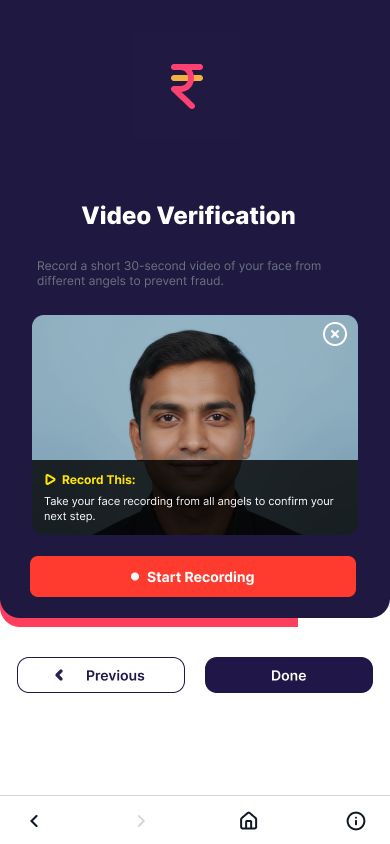
The camera preview stays clear
The tooltip that used to sit over the live camera feed is gone. A labelled "Record This" card now explains what's being recorded and why — from all angles, to prevent fraud — before the user ever taps Start Recording.
Terms & Conditions — out of the cramped modal
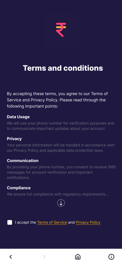
Previously a dense modal with legal text crammed into a small scrollable box, Terms & Conditions is now a full readable screen — the same content, given room to actually be read before someone taps Accept.
03 — Visual system
A dark, trustworthy system, applied consistently
Beyond those two priority fixes, I rebuilt the entire flow in a consistent dark visual system — defined type styles (Heading, Body, Caption, Label, Button) and colour styles (Brand, Surface, Text, Status) applied the same way across every screen, with a persistent bottom navigation pattern for continuity from start to finish.
Type styles
Colour styles
04 — Who I designed for
A first-time borrower, not a browser
First-time payday loan applicant
Needs cash fast, has never used this product before
Needs
- Speed over choice
- Clarity at every step
- To know it's safe before handing over ID and bank details
Will abandon if
- A step feels unclear
- A step feels invasive
- There's no sense of progress across a long flow
05 — Final solution
All twelve screens
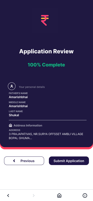
The full redesigned flow — from Terms & Conditions through mobile number entry, PAN and Aadhaar verification, personal and employment details, bank linking, video verification, and application review, to the under-review status screen.
Terms & Conditions
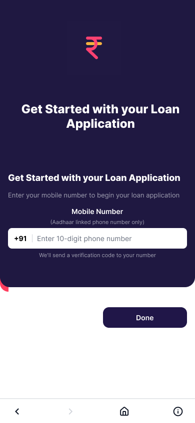 Mobile Number
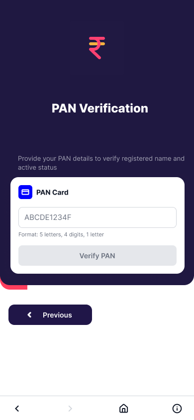 PAN Verification
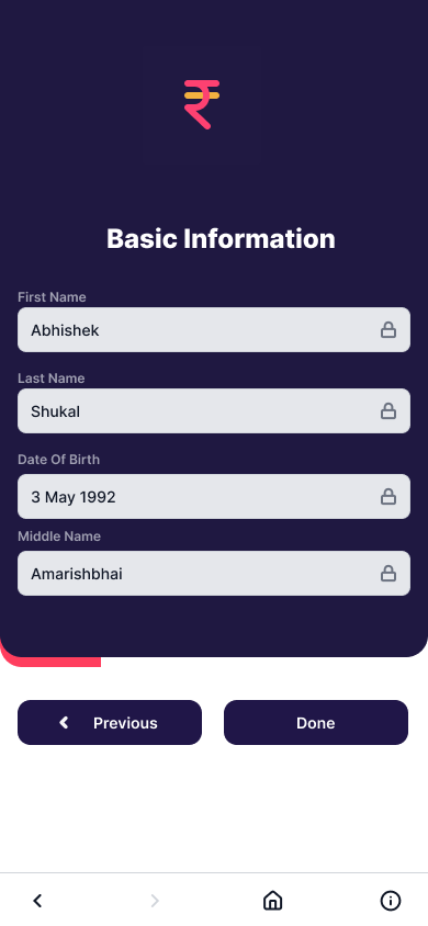 Basic Information
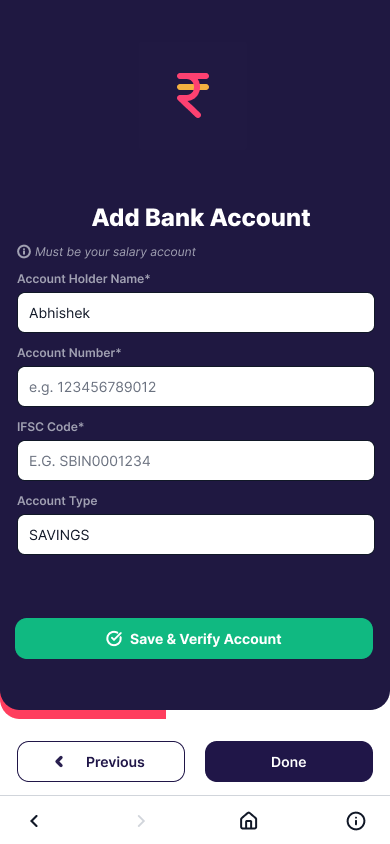 Add Bank Account
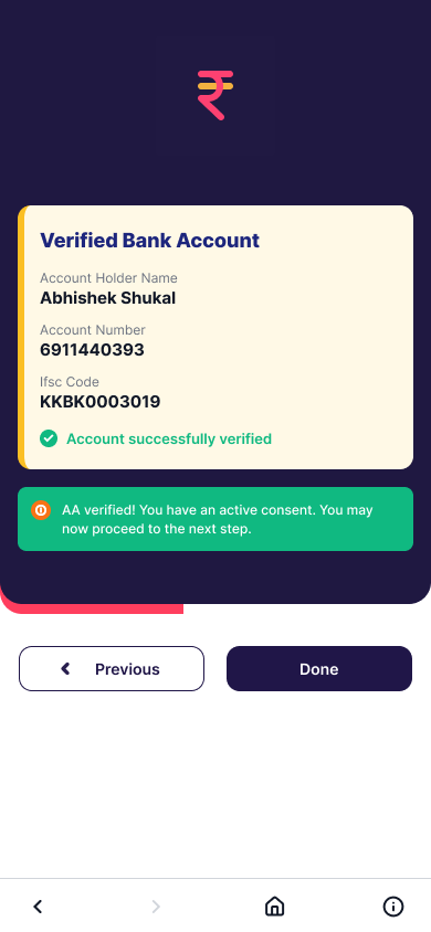 Bank Verified
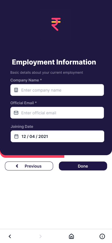 Employment Info
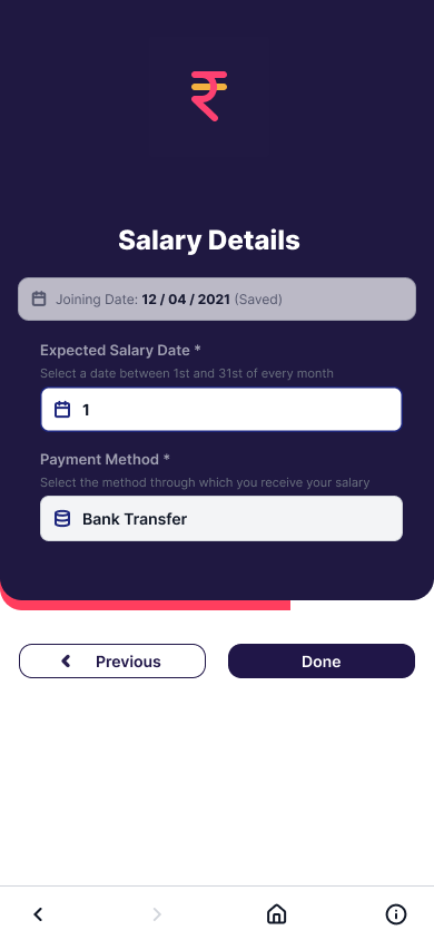 Salary Details
Video Verification
Salary Details
Video Verification
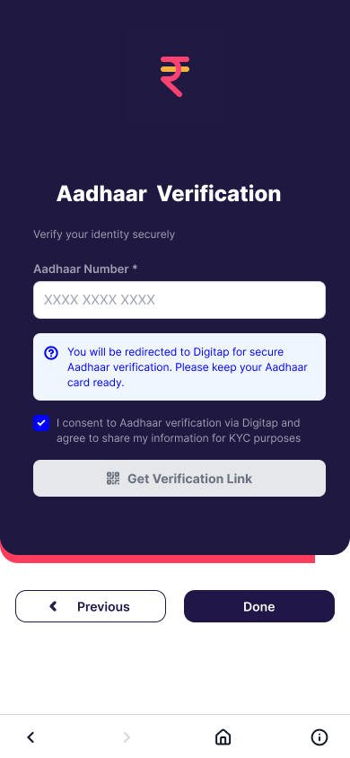 Aadhaar Verification
Application Review
Aadhaar Verification
Application Review
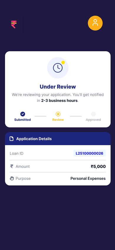 Under Review
06 — Challenges and what I'd improve
Depth over a shallow twelve-screen pass
The biggest challenge was scope: the source journey has 12+ distinct screens, and with limited time I prioritized depth on the highest-severity problems — Video Verification and Terms & Conditions — over a shallow pass across all of them.
07 — Result
Scope
12
Screens in the flow
10
Heuristics evaluated per screen
2
Highest-severity fixes shipped in depth