Product Design · UI Redesign · Web App
Mint People
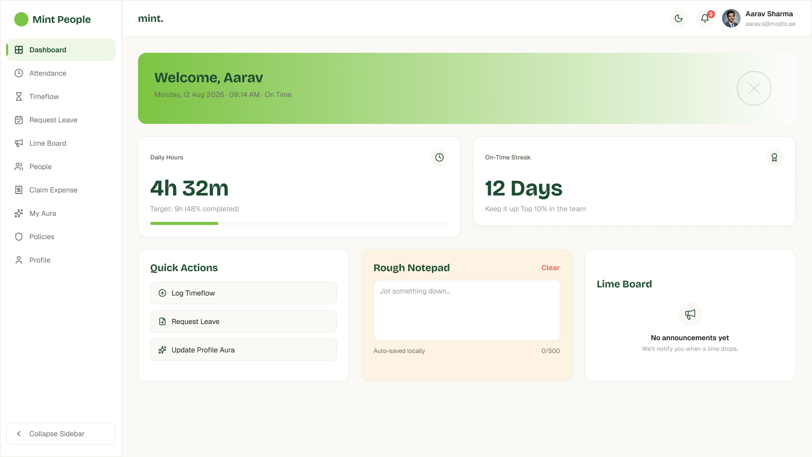
A visual rebuild of an existing HR admin panel — same six screens, same information architecture, same core data points, pushed toward a warmer, more editorial take on the product's lime-green brand.
01 — Brief & context
The brief
Mint People is an HR / people-ops admin panel — six screens covering Dashboard, Attendance, Time Flow, Request Leave, Expense Manager, and Policies, built around a lime-green brand. The reference screens read as a flat, functional admin panel with none of the personality the brand colour could support.
The brief for this rebuild wasn't to reinvent the product. It was to keep every screen's original purpose and information architecture intact — the same six screens, the same core data points — while pushing the visual system toward something warmer and more editorial.
02 — Approach
Same structure, different surface
Rather than redesign the IA, I treated this as a visual and interaction upgrade layered onto a structure that already worked — every screen keeps its original layout logic. That constraint concentrated the effort into a handful of specific, high-impact changes instead of a ground-up rebuild: making the numbers that matter easier to read at a glance, replacing a static status indicator with a real progress visualisation, and making colour do more consistent work across the product.
03 — Key design decisions
Five changes that carried the redesign
Stat numbers that actually read as numbers
Sized and weighted to lead the eye
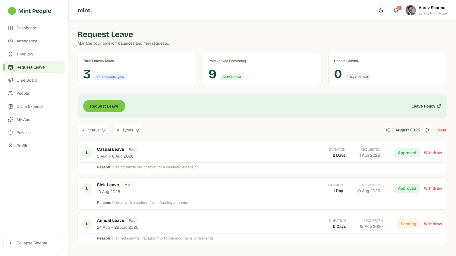
Daily Hours, On-Time Streak, and the leave and expense totals on Request Leave and Expense Manager were resized and weighted to be the first thing the eye lands on — not competing for attention with the labels and chrome around them.
A real radial progress ring
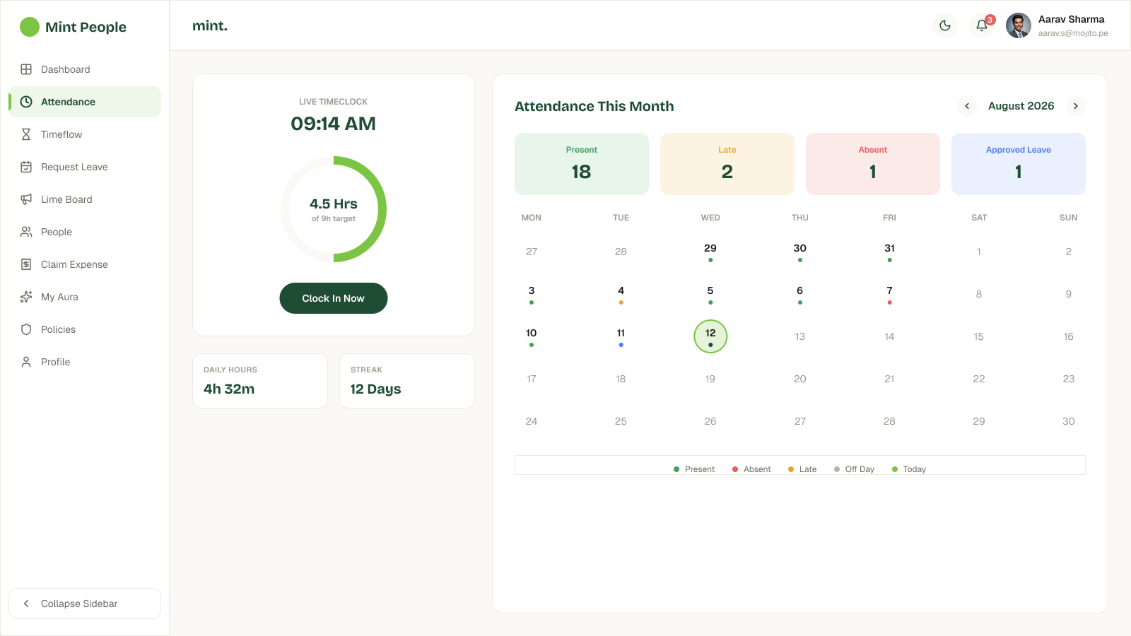
From a static circle to an actual ring
The reference's clock-in indicator was a static circle. I rebuilt it as a genuine radial progress ring tracking hours logged against the daily target, so "4.5 Hrs of 9h target" reads visually before it reads numerically.
Color-tinted status cards, consistently
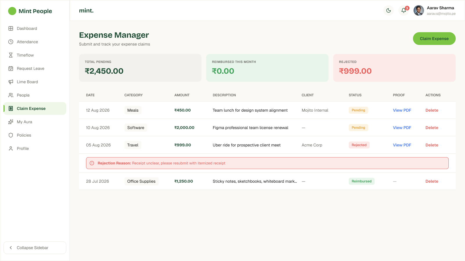
Attendance's Present / Late / Absent / Approved Leave summary and Expense Manager's Total Pending / Reimbursed / Rejected summary got the same tinted-card treatment, so status reads as colour first and number second on both screens — not just one.
Attendance — status summary
Expense Manager — status summary
Icon-badge colour per Policies category
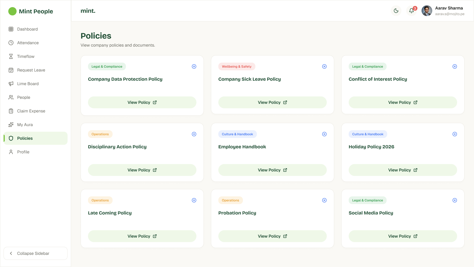
Each policy category — Legal & Compliance, Wellbeing & Safety, Operations, Culture & Handbook — got its own badge colour, so the Policies grid scans by category at a glance instead of reading as nine identical white cards.
A proper inline alert for rejected expenses
An intentional UI state, not an incidental one
The rejection reason in the reference was a plain colored row. It's now an inline alert component — icon, label, and message — so a rejected claim reads as a distinct, intentional state rather than a stray line of red text.
04 — Component system
The repeated pieces
Buttons, stat cards, and status pills recur across all six screens, so getting their weight and colour right did a lot of the visual-consistency work on its own.
 Primary button
 Secondary button
 Stat summary card
 Status pill
05 — Final solution
All six screens
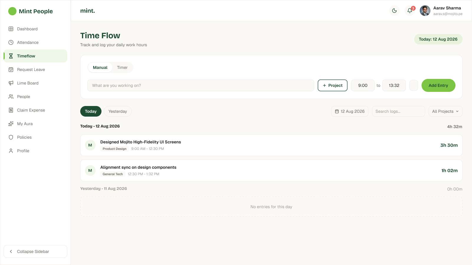
The complete rebuild spans daily overview, attendance, time logging, leave management, expense claims, and company policies — all within one consistent lime-green visual system.
Dashboard
Attendance
 Time Flow
 Request Leave
Expense Manager
Policies
Request Leave
Expense Manager
Policies
06 — The challenge
Density versus whitespace
The biggest challenge was balancing information density against whitespace on the Attendance calendar and the Time Flow entry bar — both pack a lot of controls into a small area in the original reference.
A compact entry bar with a lot of jobs to do
The Time Flow entry bar has to hold a mode toggle, a task input, a project selector, two time fields, and a submit action, all in one row without feeling cramped. The Attendance calendar has a similar problem in miniature — four status counts, a month picker, and a full grid of daily dot-indicators in the same card.
07 — Result
Scope
6
Screens redesigned
5
Visual system upgrades
4
Reusable components