App Design · Responsive UI · Packaging Design
Fitlethic
A responsive fitness app home screen — mobile and desktop, built with Auto Layout and a reusable component system — paired with packaging design for the brand's Protein Fuel product line.
01 — Brief & context
The brief
Design a home screen for Fitlethic, a fitness app, that works seamlessly across mobile (375px) and desktop (1440px) using Auto Layout and reusable components in Figma. The page needed to cover a personalised greeting, visible progress tracking, quick access to core features like workouts and meal plans, and clear calls to action — the kind of home screen that makes someone want to open the app again tomorrow.
A second, connected deliverable extended the brand off-screen: front packaging for Fitlethic Protein Fuel, a protein-bite pouch that needed to feel like it came from the same design system as the app.
02 — Design choices
Dark, bold, and card-based
I went with a dark theme — near-black backgrounds — paired with a high-energy lime green as the primary accent. It reads as bold and motivating without feeling cluttered, and lets progress indicators and CTAs stand out immediately against everything else on the screen.
The layout is card-based throughout — quick actions, stats, activities — so it scans quickly on both mobile and desktop, with the circular progress ring as the visual centrepiece, since progress tracking was the core engagement driver called out in the brief.
Design principle
The same component system carries across both screen sizes to keep the experience consistent, while adapting spacing and grouping to each format.
03 — Responsive home screen
Two screens, one system
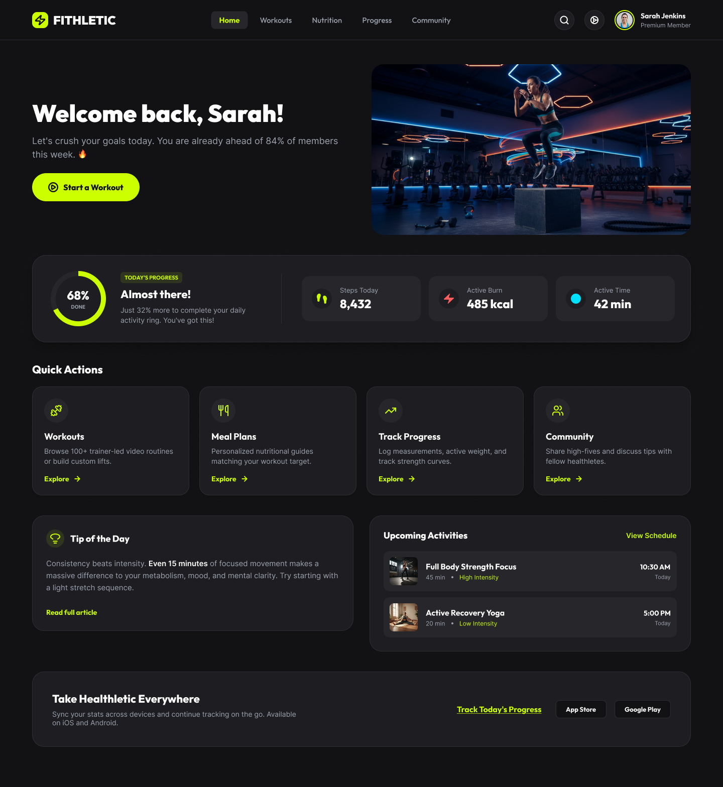
Both screens were built with Figma Auto Layout, so the greeting, progress ring, stat cards, quick actions, and daily tip all resize and regroup predictably rather than being redrawn from scratch per breakpoint. Mobile stacks everything in a single column with the "Start a Workout" CTA anchored to the bottom of the screen; desktop opens the layout into a two-column hero with a photo, and surfaces extra content — an upcoming activities list and an app-download strip — that mobile defers to secondary navigation.
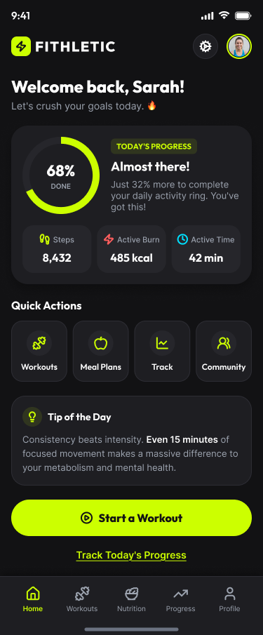
Mobile — 375px
Desktop — 1440px
The extra width goes to a full-bleed hero photo and an Upcoming Activities card next to the daily tip — content that earns its place once there's room, without changing what the progress ring or stat row communicate on mobile.
04 — Component system
Three reusable components, with variants
Buttons, stat cards, and quick-action cards repeat across both breakpoints, so each was built as a Figma component with variants rather than a one-off shape — swap the variant and the instance updates everywhere it's used.
 Button — filled / ghost / outline
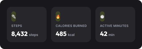 Stat card
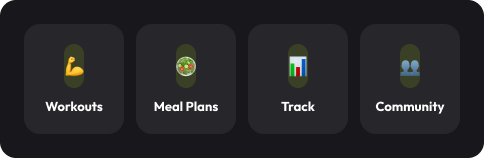 Quick action card
05 — Graphic design
Fitlethic Protein Fuel packaging
The second half of the brief was a pillow-pouch front design for Fitlethic Protein Fuel, a protein-bite snack. I designed it in Figma to keep it visually consistent with the app's component and colour system — same near-black ground, same lime accent, same bold display type — so the product would read as unmistakably Fitlethic on a shelf.
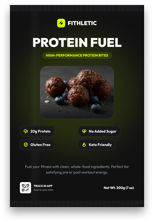
Every must-have, one system
Logo, product name, four nutrition badges, ingredient photography, and a "track in app" QR code all needed a place on the front panel. Lime-on-black badges echo the app's stat cards, and the same bold display face used for "Start a Workout" carries the headline weight on "Protein Fuel."
This was designed and finished entirely in Figma. A print-ready, high-resolution PDF export, or a rebuild in Illustrator as a true vector AI/EPS file, is a quick follow-on if either is needed for production.
06 — Result
Scope
2
Responsive breakpoints
3
Components with variants
1
Packaging design